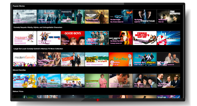
Swim lanes, rows, shelves, whatever you name them, they all make up similar pages within a TV service. Working in a product team of a TV service, we understand that a big prioritization is about standing out from the crowd. Your UI is what keeps people within your service; it’s essential that your users can easily find what they want to watch.
Audiences are increasingly spending more time watching content on OTT platforms than linear TV; for example, UK households spent, on average, 17% longer watching content on video streaming platforms than traditional TV in H1 2023. With so much competition within all on-demand markets, providers need to ensure that their users are getting the most value from their service, and the best way to showcase your catalog is through your UI – especially your homepage. Did you know that if someone can’t find what they want to watch, they are likely to switch apps or leave the platform altogether? It’s vital to reduce friction between users and the content they want to indulge in. So, how can you draw and keep your audience’s attention?
Top tips for 2024 on how to differentiate your OTT pages
Keep your UI simple – It’s important to not confuse viewers, don’t be different for difference sake, don’t make it hard to use. It’s possible to differentiate without changing the look of your UI.
Discover the most favorite content – With accurate, personalized rows, users can quickly get their eyes on the content they love most. The most suitable rows can make up a playlist where users only need to press one button to enjoy relevant content, one after another.
Emotive row titles – Not only include recommendations of classic and new films and series but also row titles that will resonate with the user. Titles that make unique connections between pieces of content, that create intrigue and connect with the user, keeping them engaged.
Descriptive explanations – Be clear and concise as to why you’re recommending items to them. Show you know them and understand their watching behavior.
Relevant headline banners – Populate your tiles with personalized imagery, such as their favorite actor as the thumbnail previews, to help increase engagement and plays.
XroadMedia powers user interfaces with predictive content scores, which are given to each user for every asset based on their profile and watching history. These are updated in real-time and ensure that every position on your homepage is being utilized in the most effective way for each and every single user.
Learn more about how our predictive scores power every touchpoint
The key is content discovery
With the overwhelming amount of choice between not just content but the number of places where to consume content, services need to ensure that they are reducing the friction between viewers and the content they want to watch. TV used to be simple, with only a few channels to choose from, services almost need to recreate that with their homepages. By implementing personalization, services can recreate simpler times, resulting in less time searching and more time watching TV. Utilizing metadata made up of information from descriptions, subtitles etc and user data to ensure that the most accurate recommendations can be made for all users.
XroadMedia helps media companies enhance their personalization experiences within the UI and beyond. Improving content discovery across TV apps, set-top boxes and more to drive engagement and deliver results. If you’re interested in learning more, get in touch with our team.


